Smart and sustainable purchases: how to make the most of the appliance bonus and how to apply. Requirements, amounts and limits to be aware of
Rebranding FederlegnoArredo, which turns 80 today
Text by
An exhibition, a postage stamp, and an all-around brand update. Andrea Meneghel, Director of Marketing, Innovation and Sustainability FederlegnoArredo, tells us about it
The celebrations for the 80th anniversary of the foundation of FederlegnoArredo began last May on the Island of San Servolo in Venice, with the staging of the Green Design Days, a multi-site festival devised to tell the story of the combination of design and sustainability through the voices of some of the most important companies in the sector. The three-day event highlighted the centrality of the wood and furniture supply chain within the Italian and international economy.
In the wake of the celebrations, on 17 September in Rome at Palazzo Piacentini, the headquarters of Mimit, there will be the unveiling of the ordinary postage stamp devoted to FederlegnoArredo designed by the graphic designer Mauro Bubbico, issued as part of the themed series The Excellence of the Production System and Made in Italy. In addition, the exhibition 80 Years of FederlegnoArredo, curated by the historian and critic Beppe Finessi with an exhibition project by Massimo Curzi, will present a series of graphic works created by Bubbico together with the history of the wood-furniture supply chain.
Added to this is an important rebranding project performed by the creative studio Sketchin: a veritable update that features a new logo, new colors, new graphics and a new website. Andrea Meneghel, as Director of Marketing, Innovation and Sustainability at FederlegnoArredo, tells us about it.
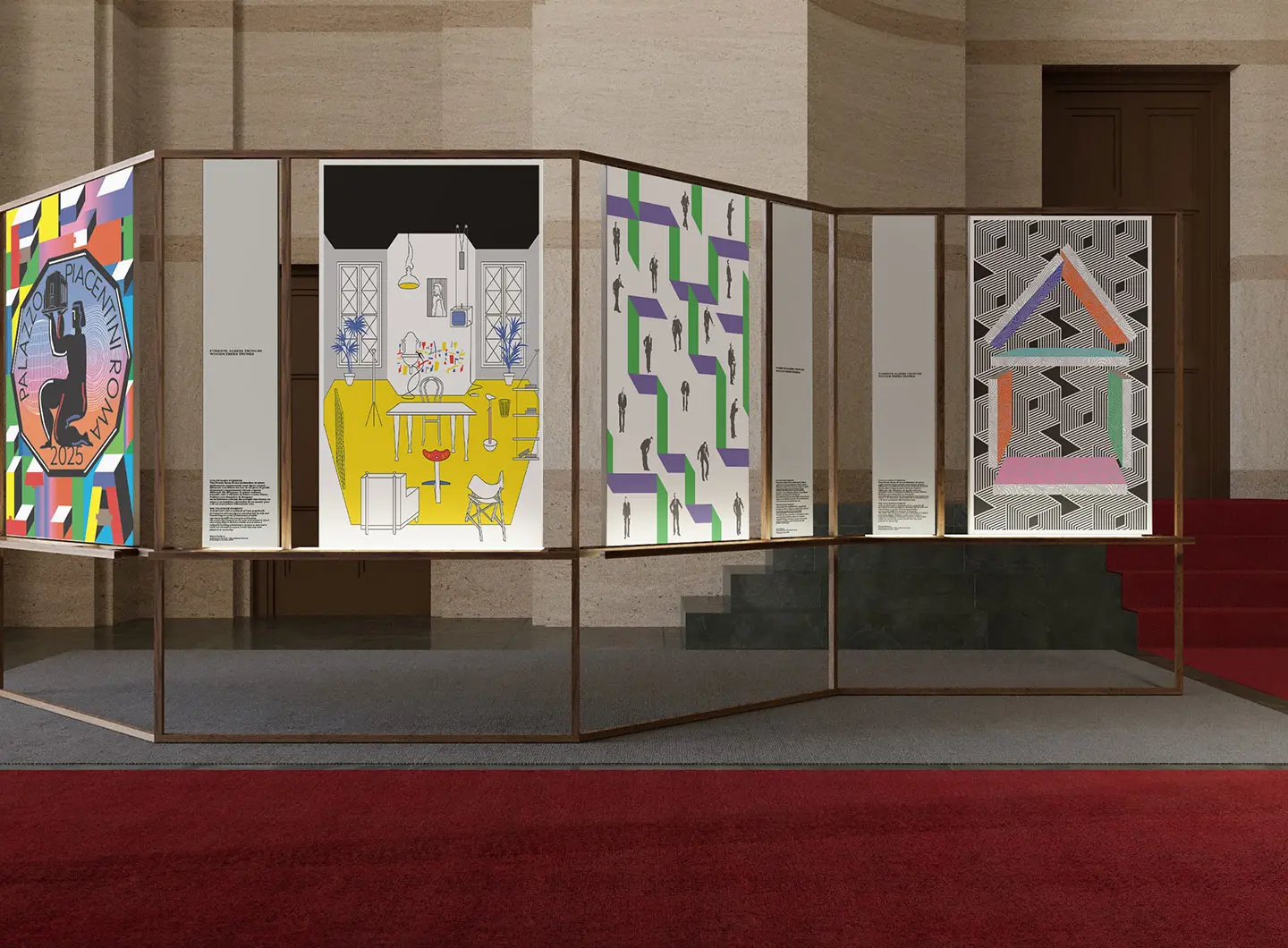
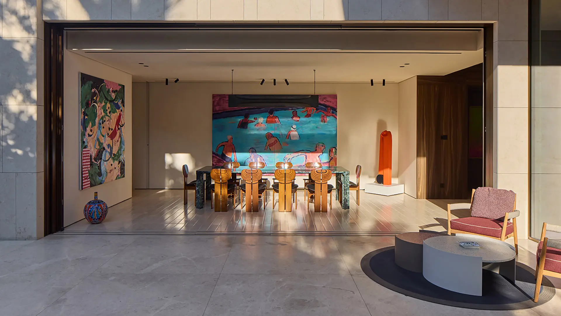
Exhibition view
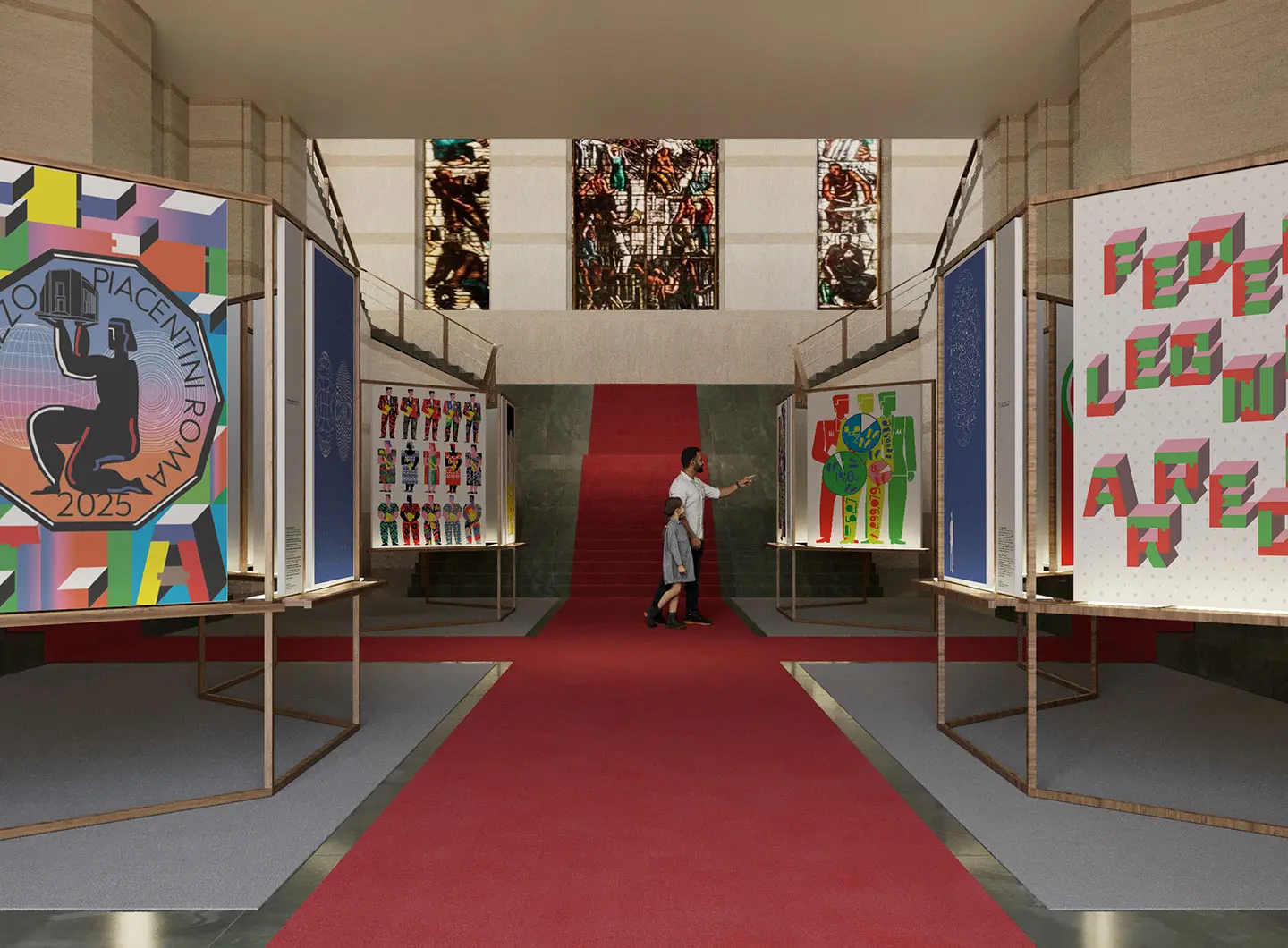
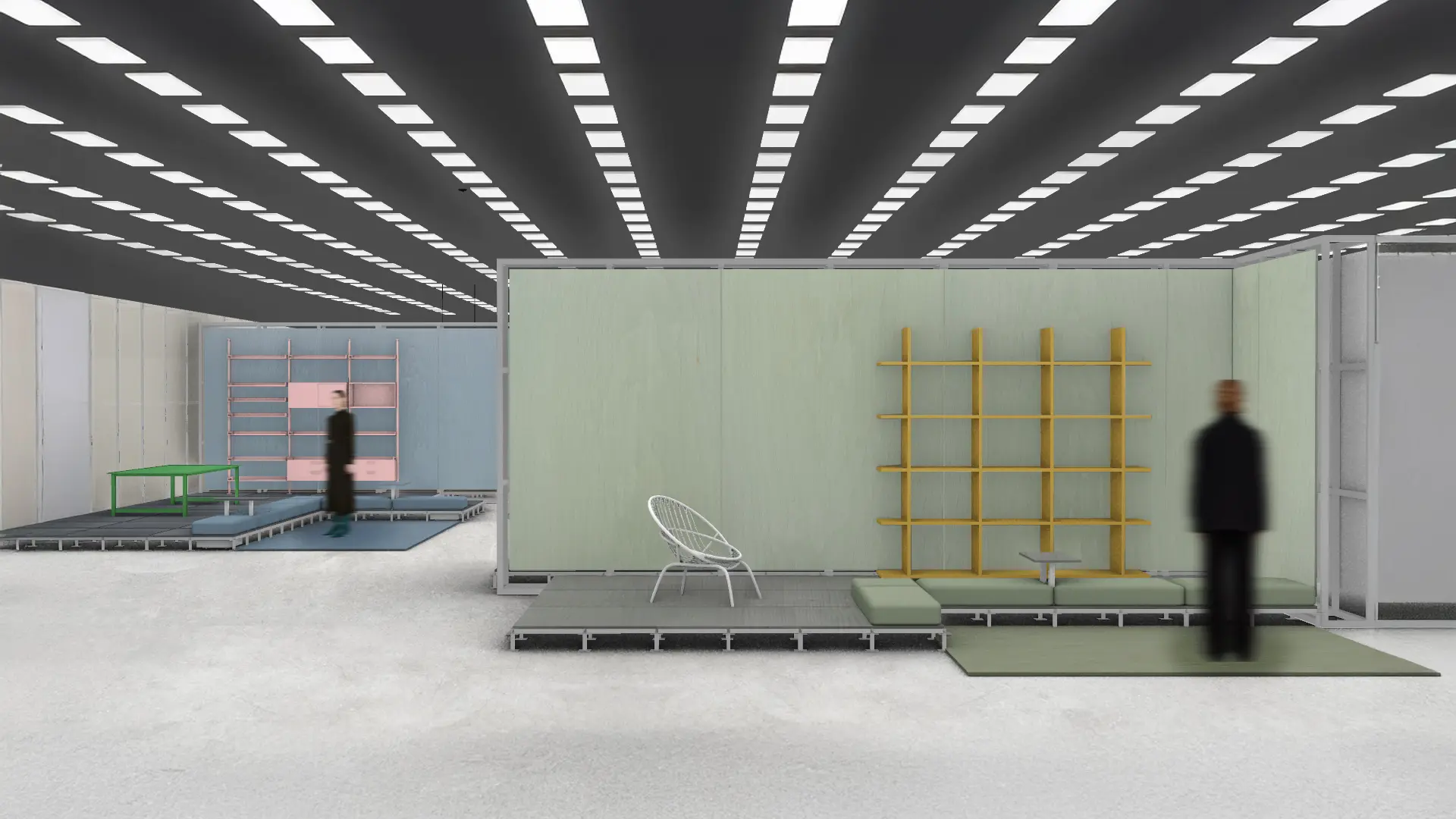
Exhibition view
The new FederlegnoArredo logo
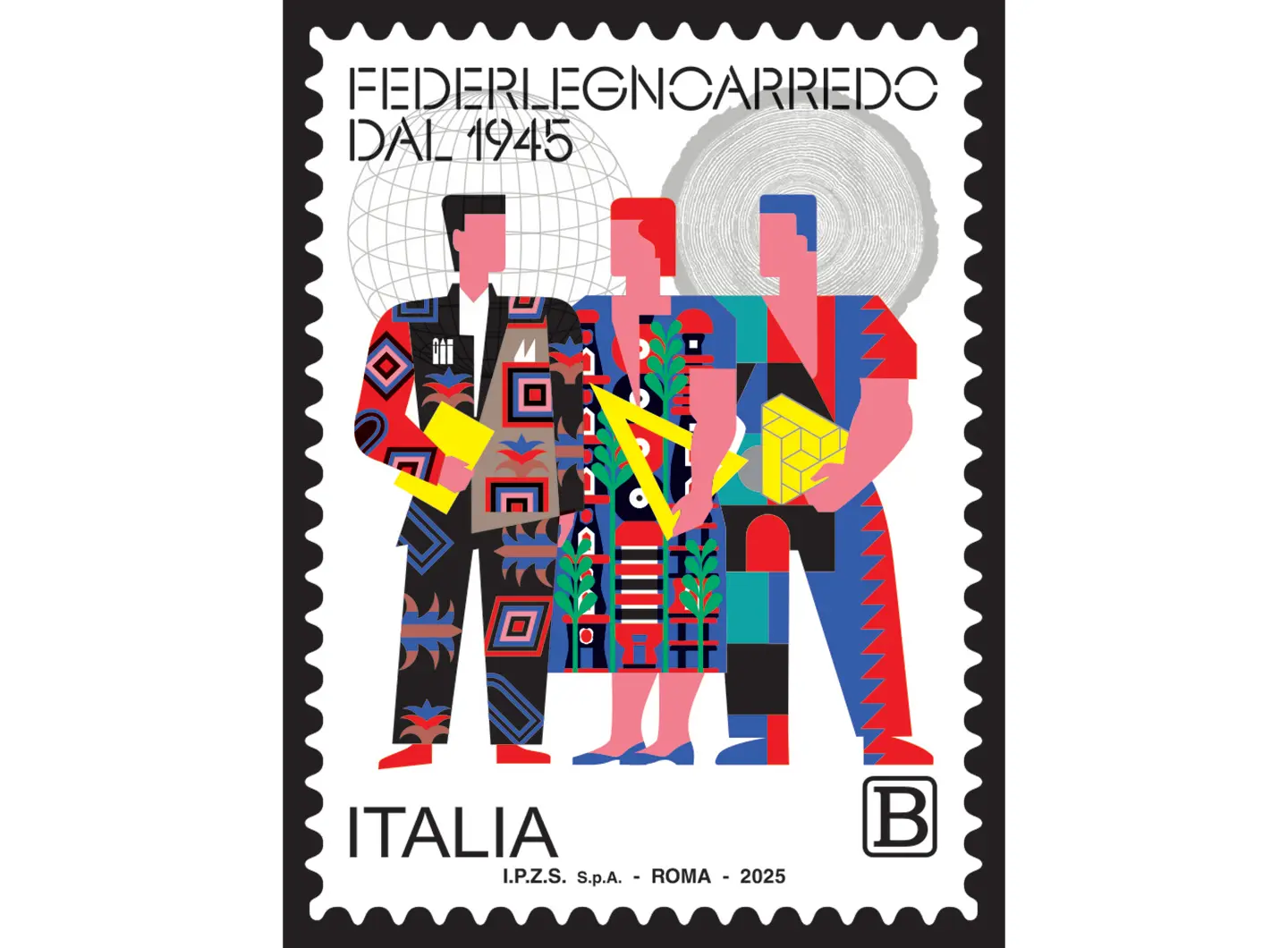
Ordinary postage stamp, by Mauro Bubbico
Let’s start from the beginning: why did you decide to work on the rebranding of FederlegnoArredo?
There are two main reasons that prompted us to undertake this. The first is the anniversary of FederlegnoArredo, which is celebrating its 80th anniversary this year. This is an important milestone and an opportunity to reflect on its past and devise an identity projected into the future. The second concerns the challenges that the market requires: increasing mastery of regulatory issues, sustainability and digitization. FLA’s new identity reflects our ability to be transformative. We have revised it, strengthened it and made it consistent with the times. It was a project that had been in the pipeline for some time, and our 80th anniversary was the right time to put it into practice.
From the point of view of creativity, who did you decide to involve in this process?
We are well aware of the complexity of our identity and the need to represent it authentically. This is why we issued a call to a series of agencies and firms of different sizes, with different approaches and working methods. The main criterion of selection was the ability to understand and interpret this complexity, combined with a solid balance between strategy and creativity, to ensure consistency and precision in execution. This process led us to select Sketchin, an agency with which we worked very well thanks to their great power of synthesis and an excellent working method. The whole process involved all the internal stakeholders, from the Presidency to the President’s Council and all our colleagues, to ensure that the new identity fully reflected all the facets of the Federation.
What are the main changes you have implemented?
The rebranding will be officially presented on 17 September, during the presentation of the postage stamp created by Mauro Bubbico devoted to the Federation and the exhibition hosted at Palazzo Piacentini in Rome. Among the most significant changes is certainly the new visual identity. The brand has been rethought. At the base there is a circle, which recalls the section of a tree, a symbol of the raw material. It becomes a triangle to represent the process of transformation into a product of excellence. It is a dynamic, three-dimensional brand, designed to be articulated to suit the contexts of use. Furthermore, from the point of view of identity, there is certainly a strengthening of the acronym FLA to increase recognition within the media world. We have also worked on a new website and a renewed tone of voice: more balanced, authoritative but also empathetic, capable of being modulated to suit different targets, whether B2B or B2C. The last big news is the brand architecture. We have defined a complex but harmonious ecosystem, with its hierarchies and logics. We have managed to represent all the souls of the Federation while respecting its specifics.
What challenges were faced in the process?
One of the most important challenges was finding the right balance between tradition and innovation. On the one hand, we wanted to preserve the past, and on the other, we wanted to give a boost to the future. This balance has been and will always be a fundamental theme in our planning. The market continues to evolve increasingly rapidly, partly as a result of the geopolitical changes taking place. This makes even more evident the need to do research and propose solutions and products that are truly identitarian for our sector. As FederlegnoArredo, we are committed to listening to and accompanying companies along this path, trying to be an element not only of understanding, but also transformative and responsive.
Does your value proposition remain the same? Are you planning new activities in the service of members?
The concept of servant leadership fully represents FederlegnoArredo’s identity: to be a guide in the service of our companies not only by responding to current needs, but also by anticipating changes and accompanying businesses in what lies ahead. With the rebranding, we wanted to strengthen this vision, enhancing the evolution of our digital services with a strong propensity for sustainability. The new identity is not just a change of image, but a coordinated system that endows all our initiatives with coherence. The project is a milestone on a path already begun in recent years, which today finds a structure capable of systematizing the different projects in a clear, recognizable and value-oriented way for the member companies.
17 September 2025
Share


Saudi Arabia, a land of new balances
Saudi Arabia is the largest FF&E (Furniture, Fixture and Equipment) market in the MENA (Middle East and North Africa) region. In 2024, it reached a value of $7.2 billion, fueled by economic diversification, rapid population expansion and reforms of the Saudi Vision 2030 strategic program.

Introducing “Salone Raritas”: the new Salone del Mobile.Milano exhibition space dedicated to limited edition design and high-end creative manufacturing
Salone Raritas will make its debut at the 64th edition of the trade fair. Curated icons, unique objects, and outsider pieces: the first direct interface between the world of special edition design, antiques and high-end craftsmanship and the professional design market professional design market (architects, interior designers, contractors, developers, dealers, etc). Leading galleries and an international audience will come together on a platform driven by a strong curatorial vision, designed to foster long-term relationships and generate business opportunities.
