Functionality and beauty are ageless. Some objects remain current and iconic over time, even after many years. Anniversaries thus become confirmation of a value that continues to speak to the present
FORO Studio designs a contemporary genderless hammam in Milan
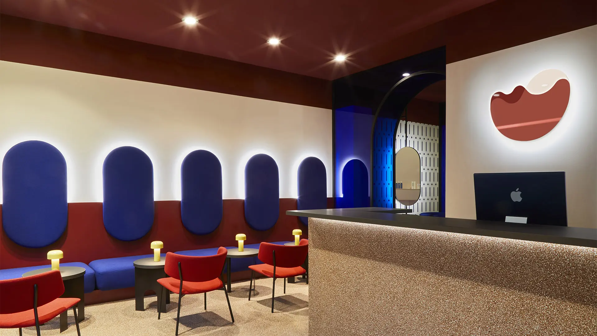
FORO Studio, Ballard & Fant, Milano, photo Francesco Romeo
Tea and beauty treatment in the desert. The new beauty & bar space, designed by the Milanese creative studio for a clientele undefined by gender, is inspired by the saturated colors of Marrakech and the harmonious coexistence of opposites
Forget the stereotype of the beauty bar all pastel colors and sugary atmospheres, largely targeting a female clientele, but also the revisited barber’s shops that tip a wink to industrial aesthetics. Ballard & Fant, the new concept store in Milan designed by FORO Studio, places the accent on hybridizing the functions and cultural fusion.
The clients, two sisters from different professional backgrounds, wanted to create a place devoted to well-being and leisure that would harmoniously combine two usually distinct indulgences – a beauty center and a cocktail bar – while embodying personal associations. (The name, for instance, repeats the sounds of the pseudonym used by their painter grandfather, Alfred Baltann.) They also wanted it to be free from any precise gender connotations, equally welcoming to users of either sex. The ideal of fluidity and the search for a balance between opposites guided the thinking of the creatives at FORO Studio from the early stages of the project, in the design of the spaces as in the decision to alternate sinuous lines with tauter geometries.
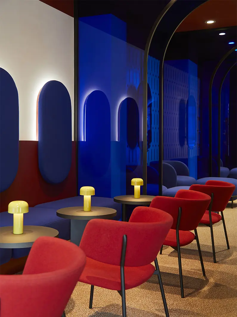
FORO Studio, Ballard & Fant, Milano, photo Francesco Romeo
The link between the two main areas, the one closest to the entryway with the bar counter and lounge and the one at the rear reserved for aesthetic treatments, is a decorative feature with a great scenic impact: a series of deep blue glass portals guides the gaze towards the beauty area, giving the space perspective depth and a theatrical feel. This liminal space also houses the boutique and the facial bar, functions that will cater for a passing public and have faster times than the more complex treatments, as well as delineating the perimeter of the two lounges.
“The management of flows and technical spaces,” the architects tell us, “was especially complex. The brief for both Ballard & Fant’s identities were quite specific and binding, so the phases of the choice of space and the layouts of the areas were the most challenging points in the whole project.”
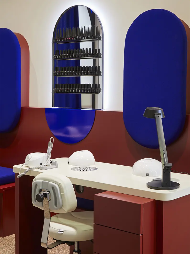
FORO Studio, Ballard & Fant, Milano, photo Francesco Romeo
The inspiration for the creation of the palette stemmed from the designers’ memory of a trip to Morocco and their experience of the space that in North Africa and the Near East provides for the functions of bodily care and socializing: the hammam. It was in Marrakech, an ancient imperial city of great contrasts that make up much of its charm, that suggested the guidelines.
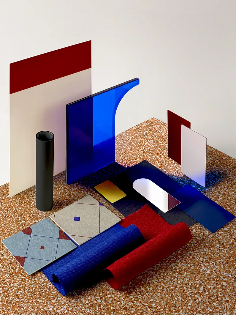
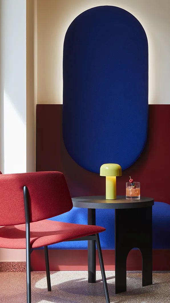
“Color is one of our favorite instruments for communicating, and in this case we played with particularly saturated tones such as brick red and electric blue, colors that are dotted about the city,” explains Alessandro Pennesi. “We studied a harmonious contrast between opposites, made up of warm tones alternating with cold, supporting a perfect balance even in the chromatic accents that follow the same unifying thread, where bright yellow contrasts with soft blue. As a backdrop, to standardize the interactions between these colors, we chose a contrasting warm and discreet beige like the desert sand.”
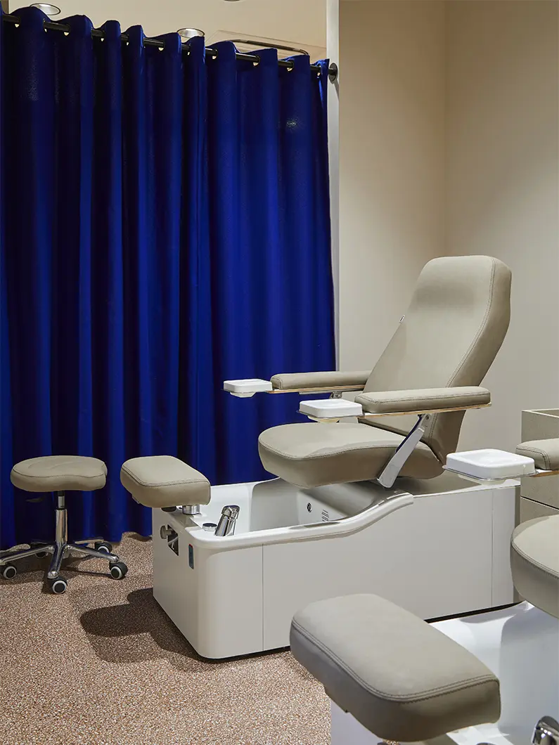
FORO Studio, Ballard & Fant, Milano, photo Francesco Romeo
The choice of materials and finishes was in keeping with this chromatic landscape. “Through the moodboard we visualized the allure of the space,” explains Pennesi. “An interplay of alternations between more or less tactile surface textures, contrasting colors and opaque and translucent finishes that create intriguing peep-through effects.”
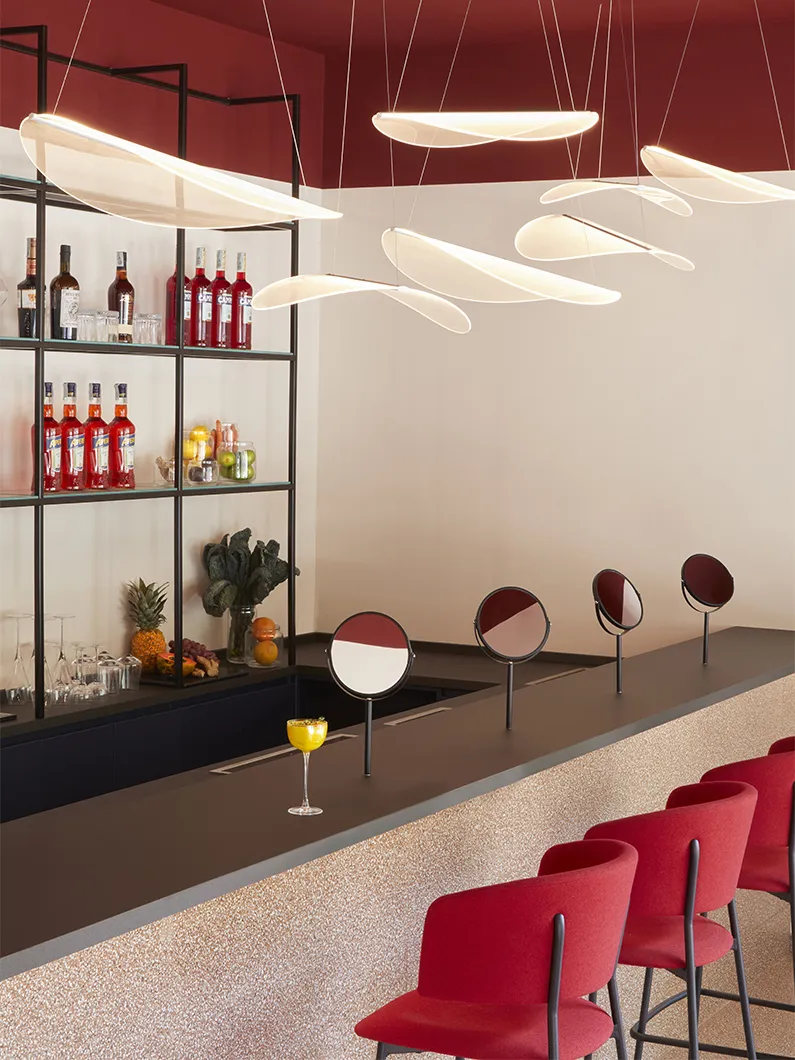
This led to the choice of stoneware tiles by Ceramica Sant'Agostino, which deck the floors and bar counter with their dense and uniform speckled pattern and bind together the different areas into which the space is divided, wth laminates from Arpa Industriale and Kaindl, used respectively for the support surfaces and the structures of the bespoke furnishings.
“We chose these materials for both aesthetic and functional reasons. Aesthetic because this type of semi-finished product has color ranges that enabled us to make choices consistent with the palette we created; and practical because they are wearproof materials and ensure easy sanitization. In particular, Fenix, a special laminate we used to coat the counter top, with a surface that has a non-porous outer layer, makes the material easy to clean and suitable for contact with food as well as fingerprint-proof and pleasant to the touch.”
Even the lighting was curated in detail, helping create a pleasant and richly detailed environment. Bellhop cordless table lamps designed by Barber & Osgerby for Flos, illuminate the tables with their discreet light. Suspended above the bar counter is a spectacular suspension composition created with a series of “leaves” in Diphy polycarbonate. Designed by Mirco Crosatto for Stilnovo, it was inspired by a fascinating Japanese plant, whose flowers turn as transparent as crystal in contact with water.


