


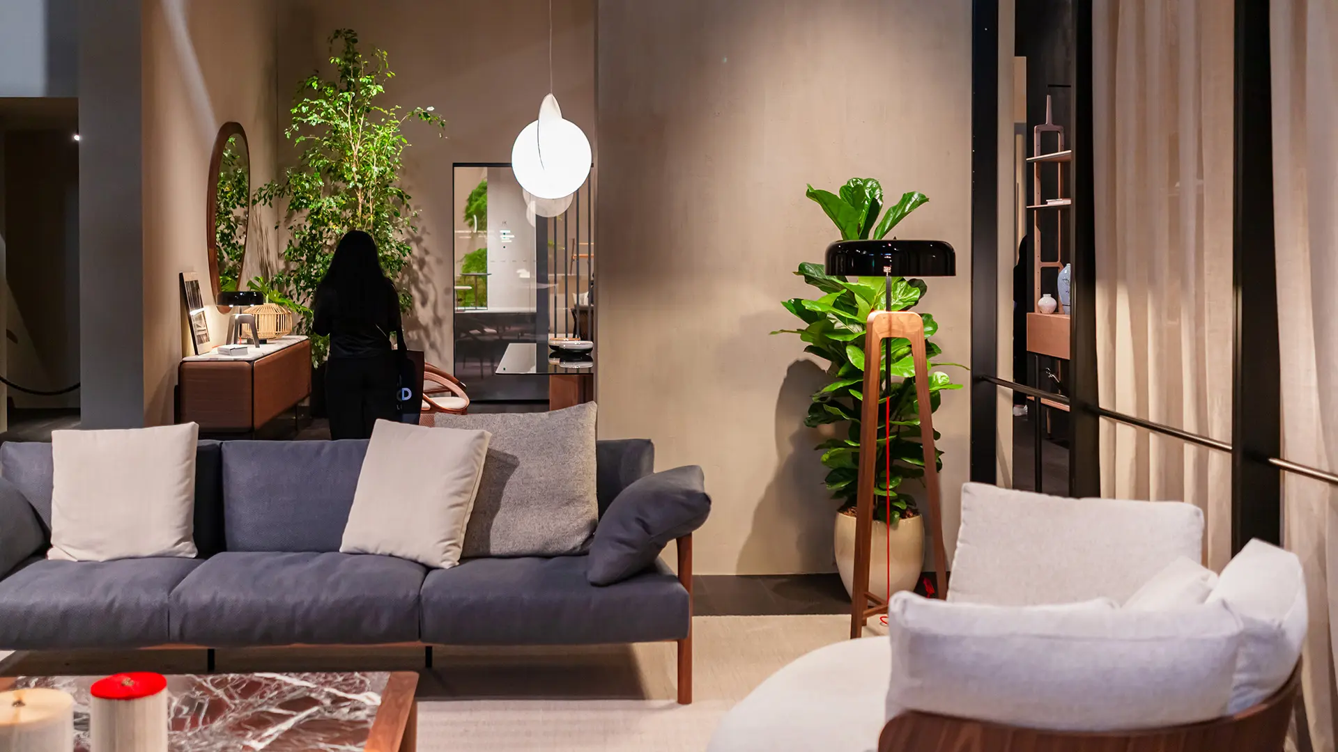
Modular, comfortable, with a refined aesthetic and sartorial details: a selection of furnishings designed to make every home interior truly unique
Re-Discovered: design is everywhere in Milan
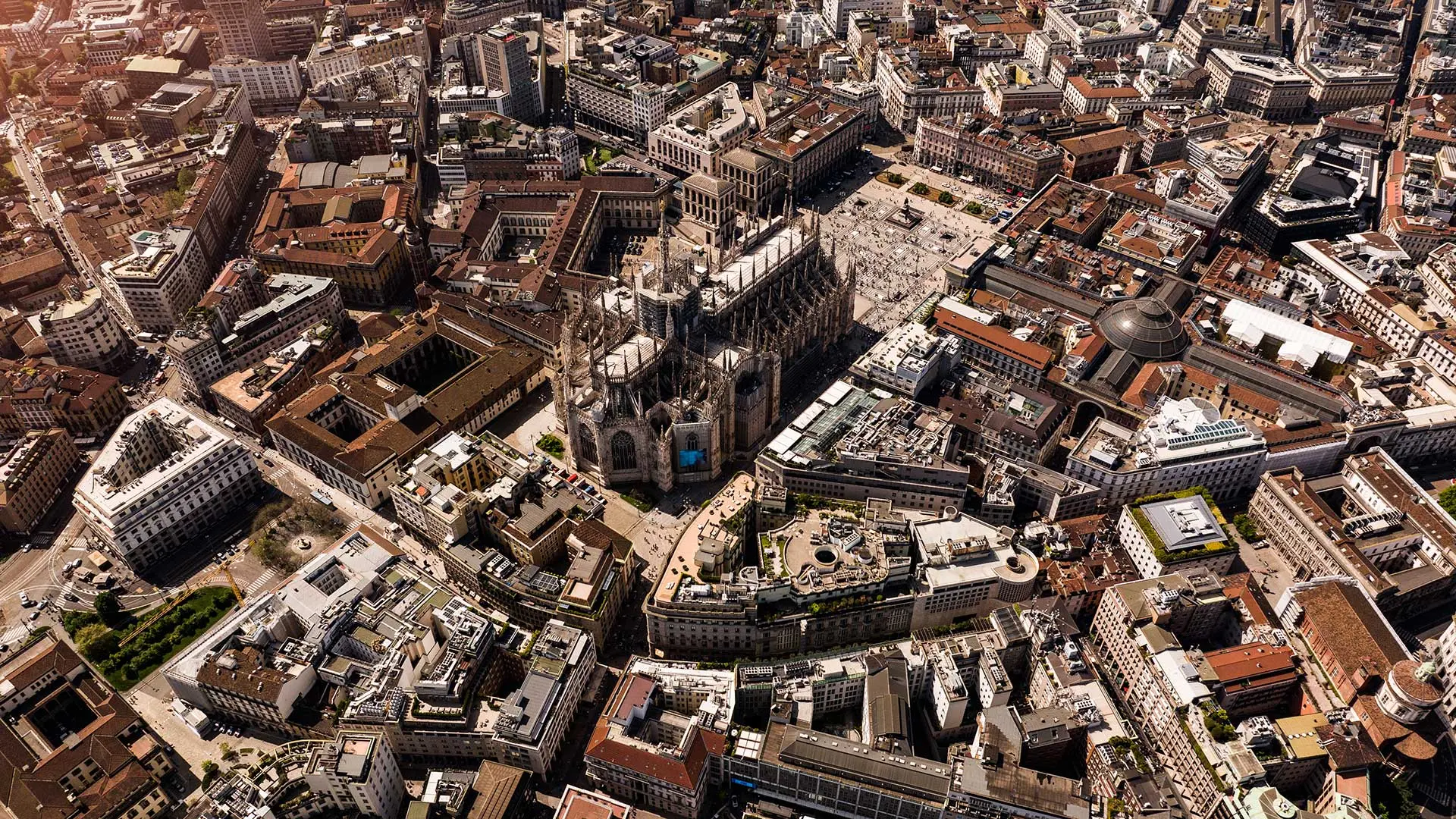
Milano, panoramic view of the city
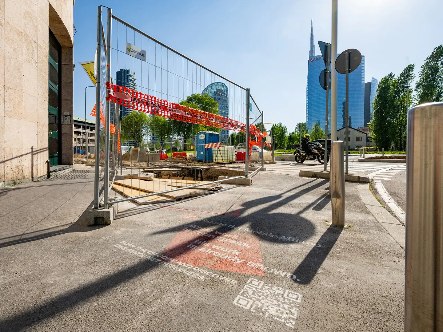
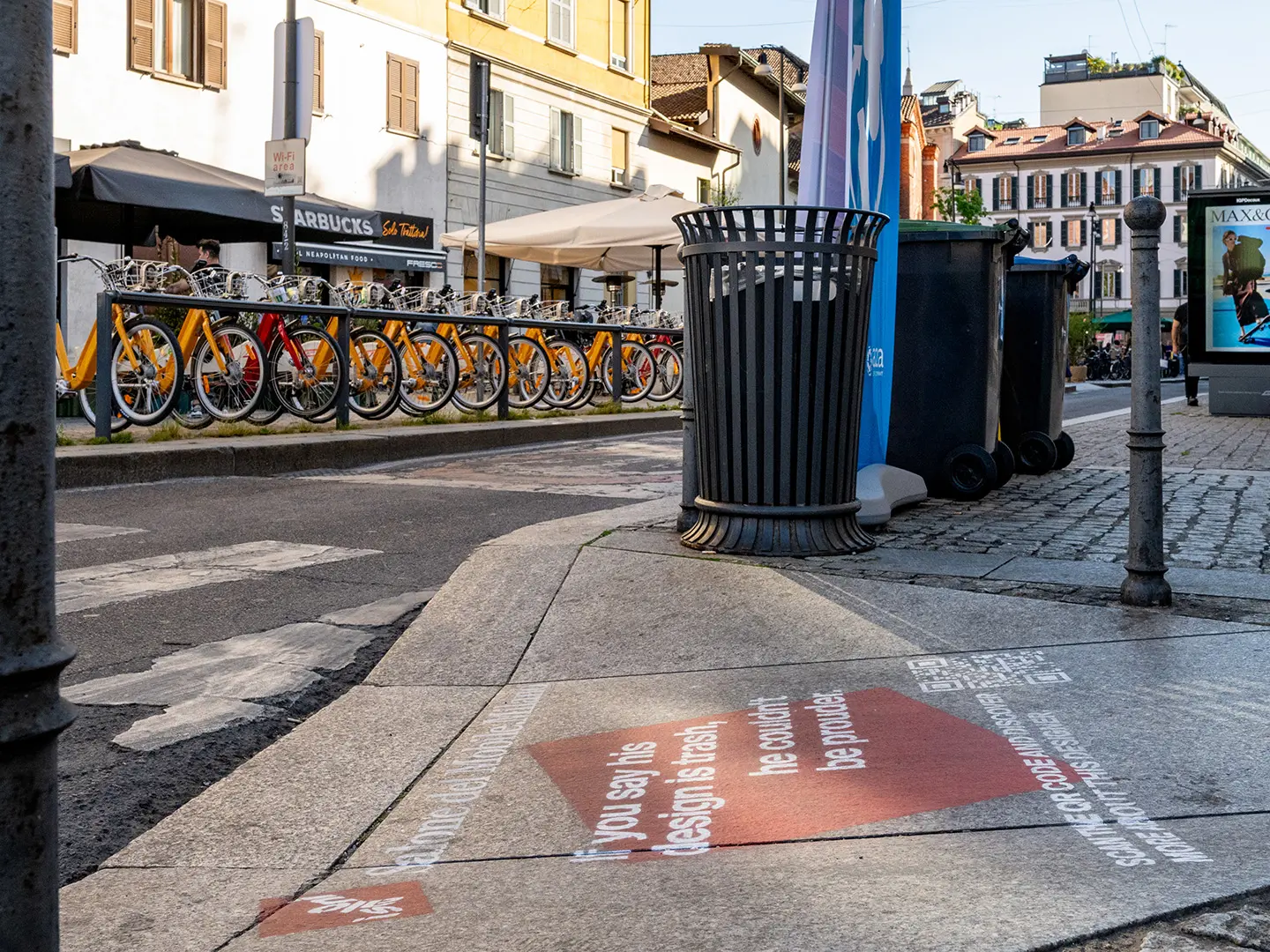
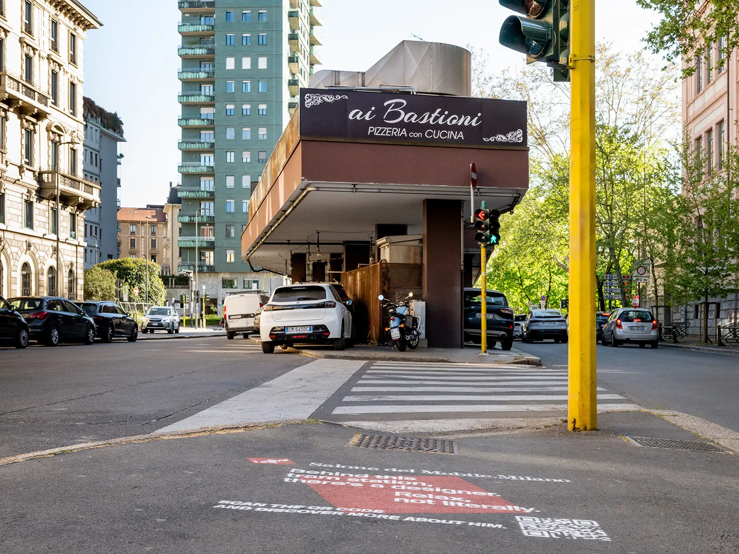
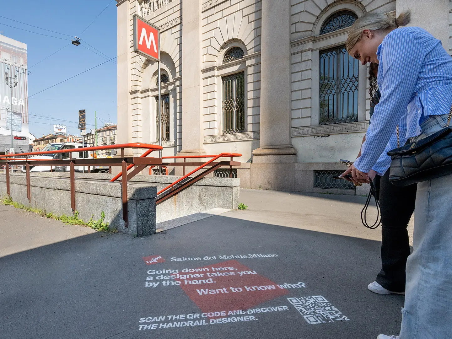
During the days of the Salone del Mobile.Milano, a series of QR codes will be affixed in the city next to objects and places that have made the public space iconic. An invitation to (re)discover the exceptional stories behind these projects
It is often said that the charm of Milan lies in its private spaces, whether they are beautiful courtyards or houses and apartments furnished with care, boldness and irony. Yet, in the supreme city of design, even the public space is dotted with many iconic projects that help define – and make people love – the unique face of this city. Sometimes this street furniture or these emblematic places are known to the general public, being embodied in the daily life of the Milanese (and not only). In other cases, however, their presence is more discreet: we risk passing by them without knowing their history and the circumstances that have contributed to giving them the form, function and location they have.
To reawaken the memory of the citizens of Milan, and accompany the many visitors who come here every year, the Salone del Mobile.Milano has prepared a project to rediscover the urban jewels of the city. Re-Discovered makes it possible to scan QR codes placed next to some large icons to discover their history. An invitation to rediscover the qualities and uniqueness of Milan: to understand that the world capital of design excels not only in the furnishings and products it creates each year, but also by the innovative solutions that transform it into an outdoor museum, where design is at home everywhere.

Milan Metro M1/M2 handrail, Franco Albini and Franca Helg, 1964
This is perhaps the symbol that has contributed most to defining the identity of Linea 1 of the Milan Metro, the famous red handrail inaugurated in 1964. In painted steel tubing, it runs like a common thread - or rather like Ariadne’s thread, as it has been termed – all through the route that goes from street level to the track, accompanying travelers in their movements. A simple and elegant figure is also the way the handrail ends, outlining an iconic “P” through the double curvature of the tube. The same that we again find, a few years later, in the handrail of the new M2.
Signage and visual features Metro Milano M1, designed by Bob Noorda, 1964
This is a project that has set the standard worldwide, helping to affirm the idea that signage and architecture have to be designed in an integrated way, following a systemic approach. Moving beyond the use of the sign as the only way to communicate the name of the station, Bob Noorda designed a long red line that runs along the whole platform repeating the station name at regular intervals: a precious help for travelers in the railcars, who often struggle to understand which stop they have reached. The typeface chosen by Noorda, Helvetica, was also partly redesigned to ensure greater readability. The Milan Metro project won the Compasso d’Oro in 1964.

Concrete bollard, Enzo Mari, 1980
How can we give even the most banal objects a form capable of responding intelligently to the context of use and the economy of available means? The challenge could only fit Enzo Mari like a glove, as a great master of Italian design for whom every project was legitimate and called for coherence, utility and elevation. As a consultant for street furniture for the Municipality of Milan, in 1980 Mari was asked to create parking bollards for Corso Vittorio Emanuele, which was about to be pedestrianized. His response was a polished concrete cylinder surmounted by a dome weighing around 100 kg, proof against attempts to move them. The design is notable for the presence of a central hole that facilitates handling by forklift. Called the Panettone, a tribute to the Milanese cake, Mari’s bollard is still in operation today and has been adopted on a large scale throughout Italy.
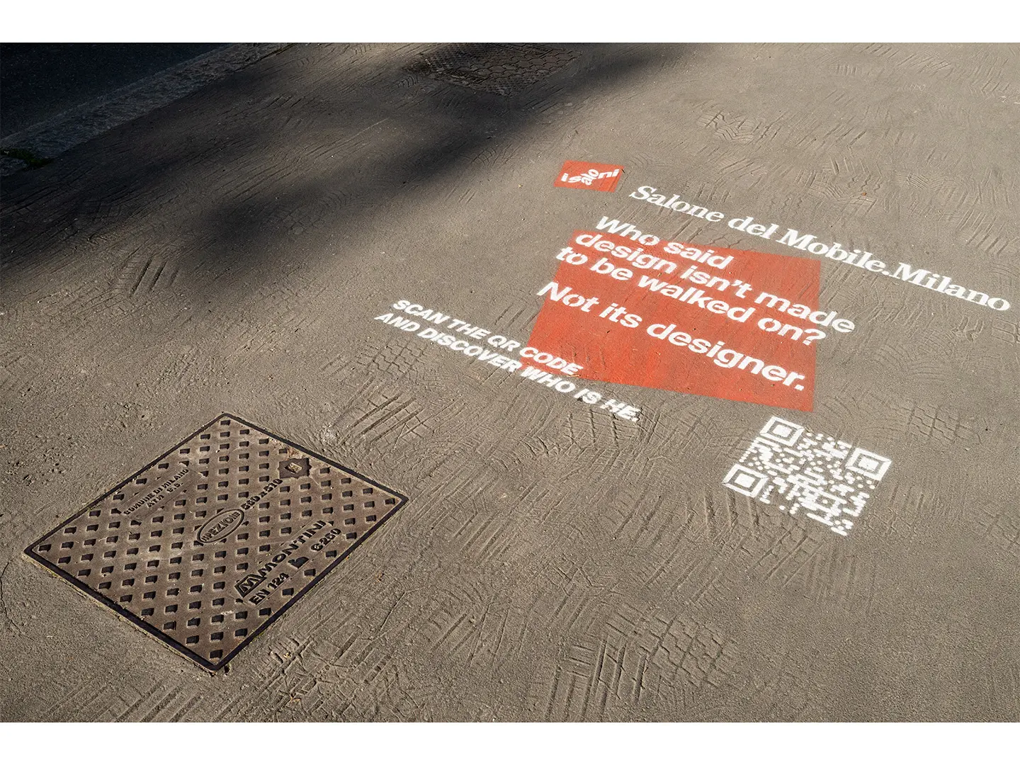
Manhole cover, Giulio Iacchetti and Matteo Ragni, Montini, 2012
Often defined as the first designer manhole cover, Iacchetti and Ragni's project relaunches this type of design beyond the dimension of anonymous design. What makes the difference is a very specific insight. The textures that distinguish the surface of the different models are not just the result of a decorative process, but a way to tell a story, such as the incursion of a wheel or the passing of a bird, or to highlight the texture of the material they’re made from: cast iron.